 Genre
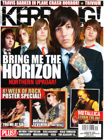
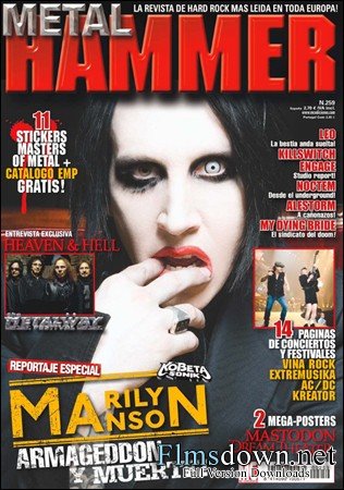
Genrei have chosen to do a rock music magazine. I chose this genre because its something i like and therefore I can create a magazine in this style, before creating a magazine i looked at some style models in the form of; Kerrang!, Rock Sound and Metal hammer. These magazines look into all the different genres based around rock music. Each magazine is aimed at male and female rock fans ages between 15-35 year olds. The most common rock magazine is kerrang! which has a wide readership. Magazines like Rock Sound concentrate on the smaller bands however they do feature some of the music industaries biggest bands.
 While looking at these magazines i noted down some things which i would like to add into my own magazine cover, contents and main story, for example; a list of bands featured in the full magazine, main story and main image to be in the center of the page, bar code and smaller images. This is common in most magazines in gives the readers a better insight into what the magazine offers.
If i were to sell my magazine, Rock Sound, Metal Hammer and Kerrang! would be some of my biggest rivals. They feature some of the biggest bands and festivals such as download and sonisphere. I hope to create a magazine what will be of the high standard which these magazines have created.
Feature article and contents pages.
 After i looked at the style models i noticed that there was no real difference between there feature articles. The feature articles all range from 2 to 4 pages. the colour scheme its kept the same throughout, however i seen a different between their contents pages. Magazines like kerrang and Metal Hammer had very busy content pages. i found that Rock Sound's contents page was less cluttered but looked more proffessional.
 Kerrange! Contents

Metal Hammer contents

I found that Kerrang! and Metal Hammer magazine have many similar features on their contents pages, for example, title and masthead, Editors Response, smaller picture of the front cover and main images. An editor’s note features on both contents pages. This is the part where the editor says something about the production of the magazine. I looked into the main features so I knew what I could have to use as part of my own contents. This would help me in creating a magazine which looked professionally done.
Metal Hammer magazine cover

Rock Sound magazine cover

When I looked at the front covers of rock sound and metal hammer magazine i found that they only used two main colours. The use of only two colours gave each magazine a more professional look. I felt that my magazine would look as professional if I only used a few colours. They each have barcodes, date and price. They also advertised free gifts and posters. Their covers only had one main image on them I thought that this was more affective because it did not look so cluttered.
Layout
 Over the time i have looked at magazines and i have found out a few things which help make up a magazine cover,contents page and feature articles. The images are examples of magazines which do this:
- The colour scheme on both pages has to be kept the same throughout the making of the magazine. This will make the magazine look more professional and not make it look so confusing.
- The cover photo should be ambitious. You can experiment with different possitions,lighting,backgrounds and styles.
 The font you choose to use should stay the same throughouth the magazine, again this will give a more professional look towards the magazine.
 - The front cover should not have many images on it.
